Hi,
I would like to fully understand the logic behind parent-child graphs and tables.
In my air-quality file I would like to know the mean of a pollutant concentration per month and per hour.
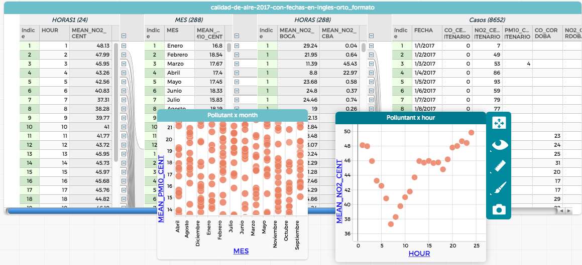
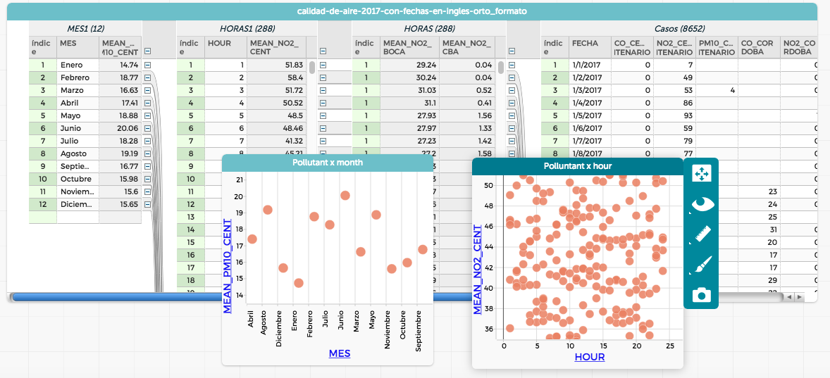
If I place “Hours” as the left-most column of the table (“parent?”) the “Pollutant x Hour” graph displays properly but the “Pollutant x Month” shows a lot of cases, and viceversa: if I place “Months” as the left-most column, the “Pollutant x Month” displays properly but the “Pollutant x Hour” doesn’t.
Is there a way to arrange data so both graphs display properly?
Here are both screenshots, each one with a different arrangement:


You can click here to access the file.
Thanks a lot.
Cristián